GoDaddy Social Composer:
Scaling Content Creation Through Better UX
 What I did
Redesigned GoDaddy’s end-to-end social composer, integrating GoDaddy Studio tools and simplifying publishing to help users create and launch polished, on-brand content with ease.
- Partnered closely with the GoDaddy Studio team to align tooling, workflows, and publishing behaviors across experiences
- Reduced friction in the publishing flow by embedding lightweight creation tools directly into the composer experience
- Identified distinct creation behaviors through user research and introduced tailored workflow paths that significantly increased post creation
Why it matters
This work made it easier for small business owners to create, customize, and publish branded social content within a single workflow.
Tools I used
Figma
UserTesting
Confluence/Jira
Fullstory
Role
Sr. UX Designer, GoDaddy
Driving the Process
A high-level view of my end-to-end design process, from early discovery and synthesis through testing and experimentation. It reflects an iterative approach grounded in continuous learning, feedback, and cross-team collaboration.

Two Products, One Workflow
GoDaddy offers two key tools to support small businesses who are looking to market their business online, a social composer within its Digital Marketing product, and GoDaddy Studio, a more advanced content creation tool with customizable templates and branding capabilities. While both aim to help users create and publish content, they exist as separate experiences—creating friction in what should be a seamless workflow.

Problem Statement
Users looking to create branded content were often pushed out of the social composer and into the more complex Studio web app. This disrupted their flow, introduced unnecessary complexity, and made it harder to quickly create and publish cohesive, on-brand content.

Understanding User Intent
Using FullStory data and my own product knowledge, I analyzed common behavioral patterns, which I distilled into 3 core user intents. Framing the experience this way revealed key friction points and directly informed more intentional, user-aligned design decisions.
Easily and quickly create my own post idea

View (and edit) a suggested post idea

Refine and schedule before publishing
These intents reflect how users actually create content, helping align the UX with their natural workflow.
Shaping the Experience

Early Explorations
I explored how Studio tools could live directly within the composer through low-fidelity wireframes and early workflow concepts. I shared these explorations with stakeholders, including the GoDaddy Studio team, to gather feedback and align on direction.

Refinement + Alignment
I collaborated with the Design Systems team to define a new composer pattern that aligned with GoDaddy's existing UX principles, without compromising flexible creation workflows.

Testable Solutions
I developed high-fidelity desktop and mobile explorations for user testing and partnered with the Design Systems team to ensure pattern alignment across platforms and breakpoints.
Validating the direction
To validate the redesigned composer experience, I conducted unmoderated prototype testing focused on two key workflows: content creation and post preview/scheduling.

What we wanted to learn
Main Goals
- Did users understand the value of the new Studio tools?
- Did the redesigned preview step improve clarity and confidence before publishing?
Other Goals
- Could users successfully customize content per platform?
- Which editing tools felt most valuable?
- Where did users hesitate or become confused?

What we tested
Tested compose + preview workflows
Included platform-specific editing tasks
Compose Step
Preview Step

Platform-specific edit tools

How we tested
Unmoderated click-through prototype test with 10 small business owners
Step 1: Compose
I began by testing the compose experience to understand whether users found the new studio tools intuitive, valuable, and easy to incorporate into their content creation workflow.

Test participants immediately understood the value of creating branded content directly within the composer, validating the decision to integrate Studio tools into the workflow.
Most valuable tools
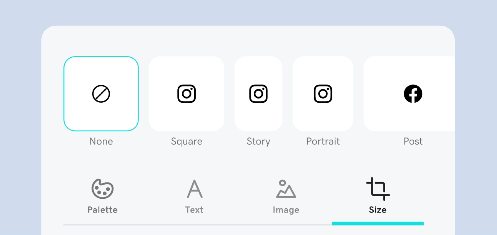
Participants gravitated toward branding and resizing tools, validating the importance of supporting lightweight cross-platform customization directly within the composer experience.
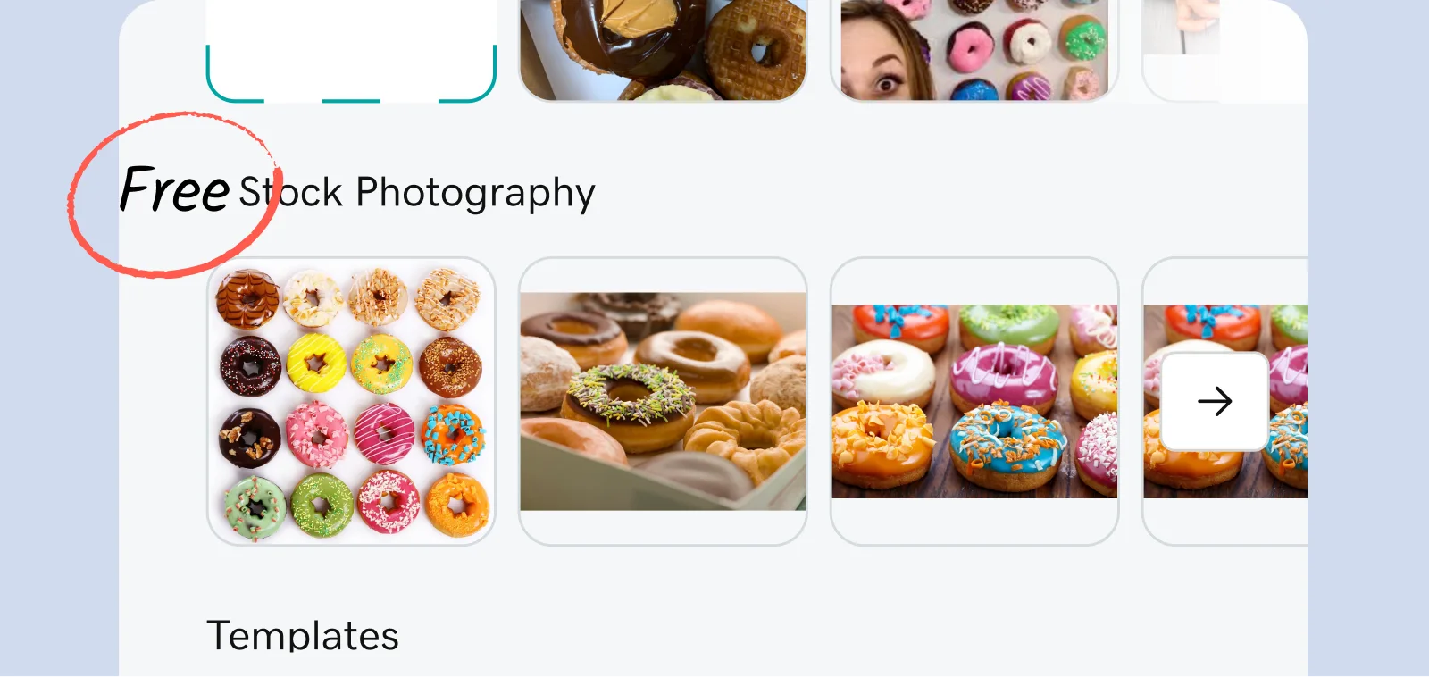
Clarifying free assets
Users occasionally hesitated around stock imagery, unsure whether the assets were free to use. This insight led to a simple but impactful content update: changing the label from 'Stock Photos' to 'Free Stock Photos.'
Step 2: Preview
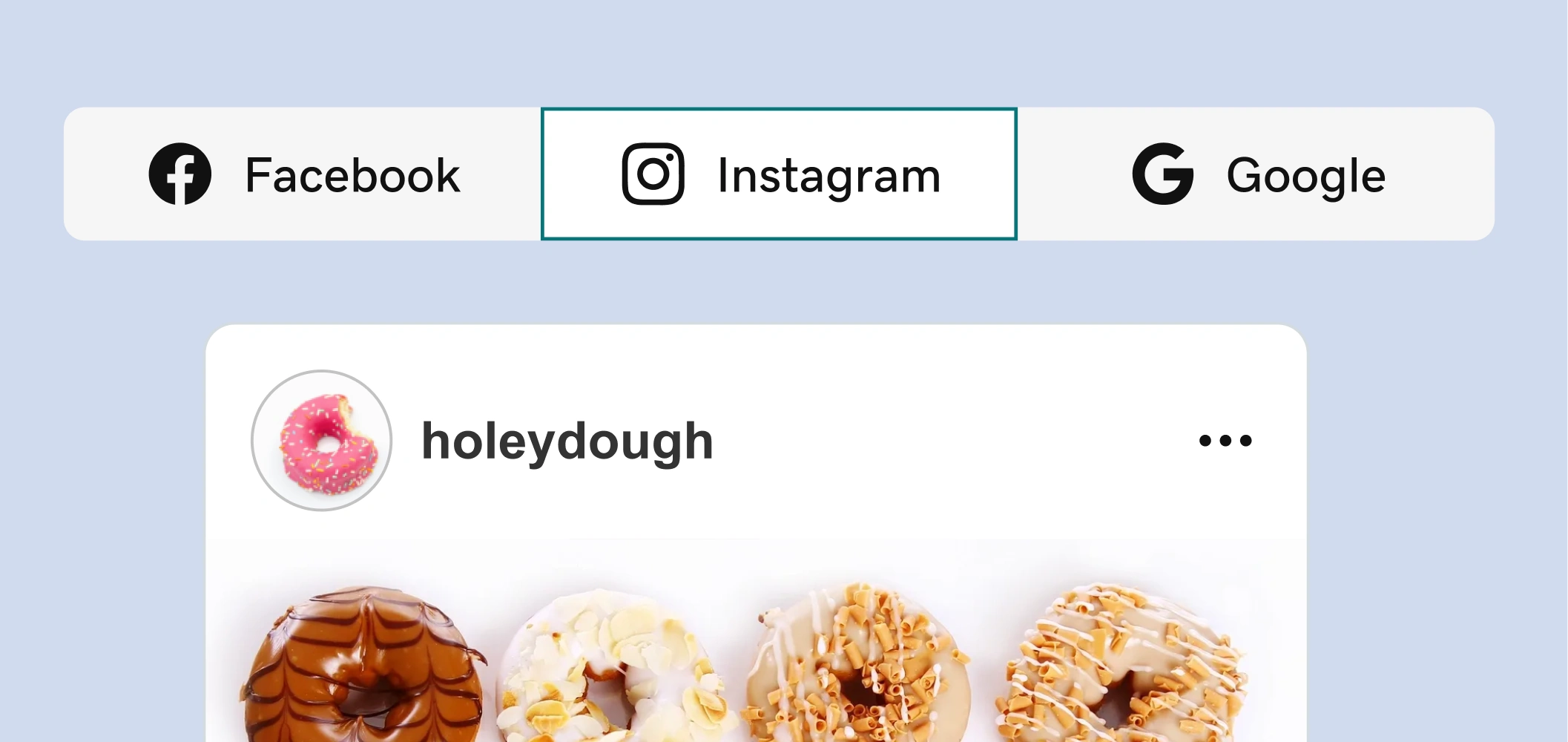
Next, we tested the redesigned preview experience to evaluate whether users understood how to both preview and customize their post content across platforms before publishing.
Previewing content across multiple formats in one place helped participants feel more confident before publishing.
What stood out
The ability to preview multiple post formats in one place consistently stood out as a "wow" moment. Participants quickly understood how their content would appear across platforms, making the publishing process feel more predictable and trustworthy.
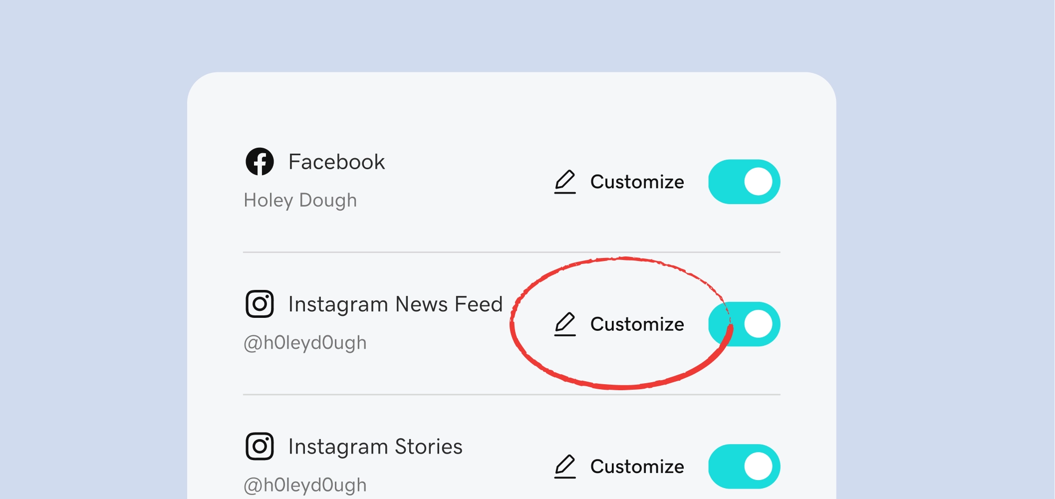
Making customization more obvious
Our test results revealed that participants did not immediately understand what the pencil icon would do in this context. To improve clarity, we replaced the icon-only treatment with a descriptive action label.
Final Experience
The final experience evolved existing interfaces to better meet user needs and brought lightweight creation tools directly into the workflow, making it easier for users to create, preview, and customize branded content without leaving the composer.
Compose Step Before
Compose Step After
From a basic text-entry experience
to an integrated branded content workflow
Preview Step Before
Preview Step After
From a long, scroll-heavy scheduling flow
to an interactive multi-platform preview experience
Designing for User Intents
The behavioral patterns identified early in the project continued to shape the experience after launch. Post-launch data reinforced that users entered the composer with different levels of intent—some wanted to quickly execute their own idea, while others preferred to begin with inspiration. To better support these behaviors, we introduced a faster path into content creation by surfacing suggested posts directly within the preview step.
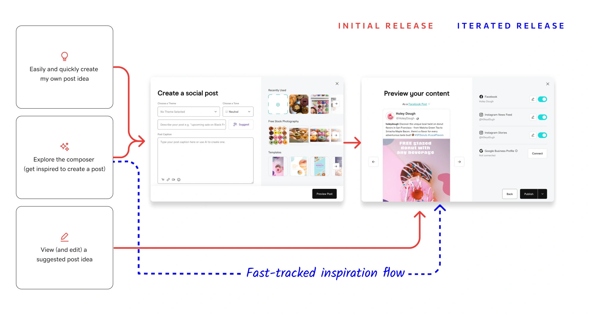
Fast-tracking inspiration-led users directly into suggested post ideas via the preview step resulted in a 24% increase in post creation.
Company Impact
Across two releases, the redesigned composer evolved from a lightweight content creation enhancement into a more adaptive publishing workflow. Each iteration built on behavioral insights gathered throughout the project.
Release 1
+62%
Increase in image usage
(including studio templates)
Release 1
+5%
Overall post creation
Release 2
+52%
Post creation conversion
Up from 32.8% pre-rollout
Release 2
75%
Platform connection rate
Up from 25% pre-rollout
GoDaddy Social Composer:
Scaling Content Creation Through Better UX
What I did
Redesigned GoDaddy’s end-to-end social composer, integrating GoDaddy Studio tools and simplifying publishing to help users create and launch polished, on-brand content with ease.
- Partnered closely with the GoDaddy Studio team to align tooling, workflows, and publishing behaviors across experiences
- Reduced friction in the publishing flow by embedding lightweight creation tools directly into the composer experience
- Identified distinct creation behaviors through user research and introduced tailored workflow paths that significantly increased post creation
Why it matters
This work made it easier for small business owners to create, customize, and publish branded social content within a single workflow.
Tools I used
Figma
UserTesting
Confluence/Jira
Fullstory
Role
Sr. UX Designer, GoDaddy
Driving the Process
A high-level view of my end-to-end design process, from early discovery and synthesis through testing and experimentation. It reflects an iterative approach grounded in continuous learning, feedback, and cross-team collaboration.
Two Products, One Workflow
GoDaddy offers two key tools to support small businesses who are looking to market their business online, a social composer within its Digital Marketing product, and GoDaddy Studio, a more advanced content creation tool with customizable templates and branding capabilities. While both aim to help users create and publish content, they exist as separate experiences—creating friction in what should be a seamless workflow.
Problem Statement
Users looking to create branded content were often pushed out of the social composer and into the more complex Studio web app. This disrupted their flow, introduced unnecessary complexity, and made it harder to quickly create and publish cohesive, on-brand content.
Understanding User Intent
Using FullStory data and my own product knowledge, I analyzed common behavioral patterns, which I distilled into 3 core user intents. Framing the experience this way revealed key friction points and directly informed more intentional, user-aligned design decisions.
Easily and quickly create my own post idea
View (and edit) a suggested post idea
Refine and schedule before publishing
These intents reflect how users actually create content, helping align the UX with their natural workflow.
Shaping the Experience
Early Explorations
I explored how Studio tools could live directly within the composer through low-fidelity wireframes and early workflow concepts. I shared these explorations with stakeholders, including the GoDaddy Studio team, to gather feedback and align on direction.
Refinement + Alignment
I collaborated with the Design Systems team to define a new composer pattern that aligned with GoDaddy's existing UX principles, without compromising flexible creation workflows.
Testable Solutions
I developed high-fidelity desktop and mobile explorations for user testing and partnered with the Design Systems team to ensure pattern alignment across platforms and breakpoints.
Validating the direction
To validate the redesigned composer experience, I conducted unmoderated prototype testing focused on two key workflows: content creation and post preview/scheduling.
What we wanted to learn
Main Goals
- Did users understand the value of the new Studio tools?
- Did the redesigned preview step improve clarity and confidence before publishing?
Other Goals
- Could users successfully customize content per platform?
- Which editing tools felt most valuable?
- Where did users hesitate or become confused?
What we tested
Tested compose + preview workflows
Included platform-specific editing tasks
Compose Step
Preview Step
Platform-specific edit tools
How we tested
Unmoderated click-through prototype test with 10 small business owners
Step 1: Compose
I began by testing the compose experience to understand whether users found the new studio tools intuitive, valuable, and easy to incorporate into their content creation workflow.
Test participants immediately understood the value of creating branded content directly within the composer, validating the decision to integrate Studio tools into the workflow.
Most valuable tools
Participants gravitated toward branding and resizing tools, validating the importance of supporting lightweight cross-platform customization directly within the composer experience.
Clarifying free assets
Users occasionally hesitated around stock imagery, unsure whether the assets were free to use. This insight led to a simple but impactful content update: changing the label from 'Stock Photos' to 'Free Stock Photos.'
Step 2: Preview
Next, we tested the redesigned preview experience to evaluate whether users understood how to both preview and customize their post content across platforms before publishing.
Previewing content across multiple formats in one place helped participants feel more confident before publishing.
What stood out
The ability to preview multiple post formats in one place consistently stood out as a "wow" moment. Participants quickly understood how their content would appear across platforms, making the publishing process feel more predictable and trustworthy.
Making customization more obvious
Our test results revealed that participants did not immediately understand what the pencil icon would do in this context. To improve clarity, we replaced the icon-only treatment with a descriptive action label.
Final Experience
The final experience evolved existing interfaces to better meet user needs and brought lightweight creation tools directly into the workflow, making it easier for users to create, preview, and customize branded content without leaving the composer.
Compose Step Before
Compose Step After
From a basic text-entry experience
to an integrated branded content workflow
Preview Step Before
Preview Step After
From a long, scroll-heavy scheduling flow
to an interactive multi-platform preview experience
Designing for User Intents
The behavioral patterns identified early in the project continued to shape the experience after launch. Post-launch data reinforced that users entered the composer with different levels of intent—some wanted to quickly execute their own idea, while others preferred to begin with inspiration. To better support these behaviors, we introduced a faster path into content creation by surfacing suggested posts directly within the preview step.
Fast-tracking inspiration-led users directly into suggested post ideas via the preview step resulted in a 24% increase in post creation.
Company Impact
Across two releases, the redesigned composer evolved from a lightweight content creation enhancement into a more adaptive publishing workflow. Each iteration built on behavioral insights gathered throughout the project.
Release 1
+62%
Increase in image usage
(including studio templates)
Release 1
+5%
Overall post creation
Release 2
+52%
Post creation conversion
Up from 32.8% pre-rollout
Release 2
75%
Platform connection rate
Up from 25% pre-rollout